Country Shares of World GDP
Here's a chart of world GDP, broken down by country share. (HT: Carpe Diem).
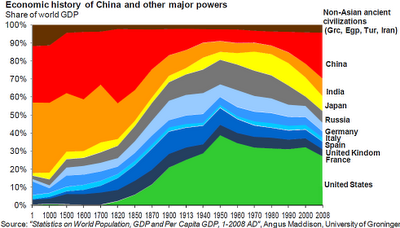
Careful with the x-axis, it is not at all to scale!
The basic idea is that India and China had large shares pre-industrial revolution, after which Europe rose. The U.S. shoots up, to over 40% of world GDP by 1950. Then, Japan begins to grow in the 1960s, and China in the 1980s.


Careful with the x-axis, it is not at all to scale!
The basic idea is that India and China had large shares pre-industrial revolution, after which Europe rose. The U.S. shoots up, to over 40% of world GDP by 1950. Then, Japan begins to grow in the 1960s, and China in the 1980s.

Suppose countries end up with GDPs proportionate to their populations. What would that picture look like? I've added a bar to the right, showing the break-down of world-population. Look at the U.S. squished down, with less that 400 million out of a world population of over 7,000 million.

The biggest change is in the previously un-noticed 'rest of the world". If Africa, the Middle East and so on moved toward freedom, that could be the story of the century.
What if they do not? Here's a chart with a new assumption. Suppose the "rest-of-world" does not increase its relative share significantly, but the shares of all the other countries did become proportionate to their populations? Here's what we would see: China and India would far outweigh all others, followed by the U.S.

None of this is a prediction, by any stretch of the imagination. I'm significantly more bullish on the U.S. in relative terms. Still, it's an interesting "what if". It also puts the so-called "U.S. decline" into perspective.

Where was the Philippines compared to Japan in 1950 compared to 2013/
ReplyDelete